Turning No Into Regret with Loss Aversion
Boost conversions by framing offers around what users lose when they say no
Most marketing offers are easy to ignore - unless they make you second-guess what you're turning down.
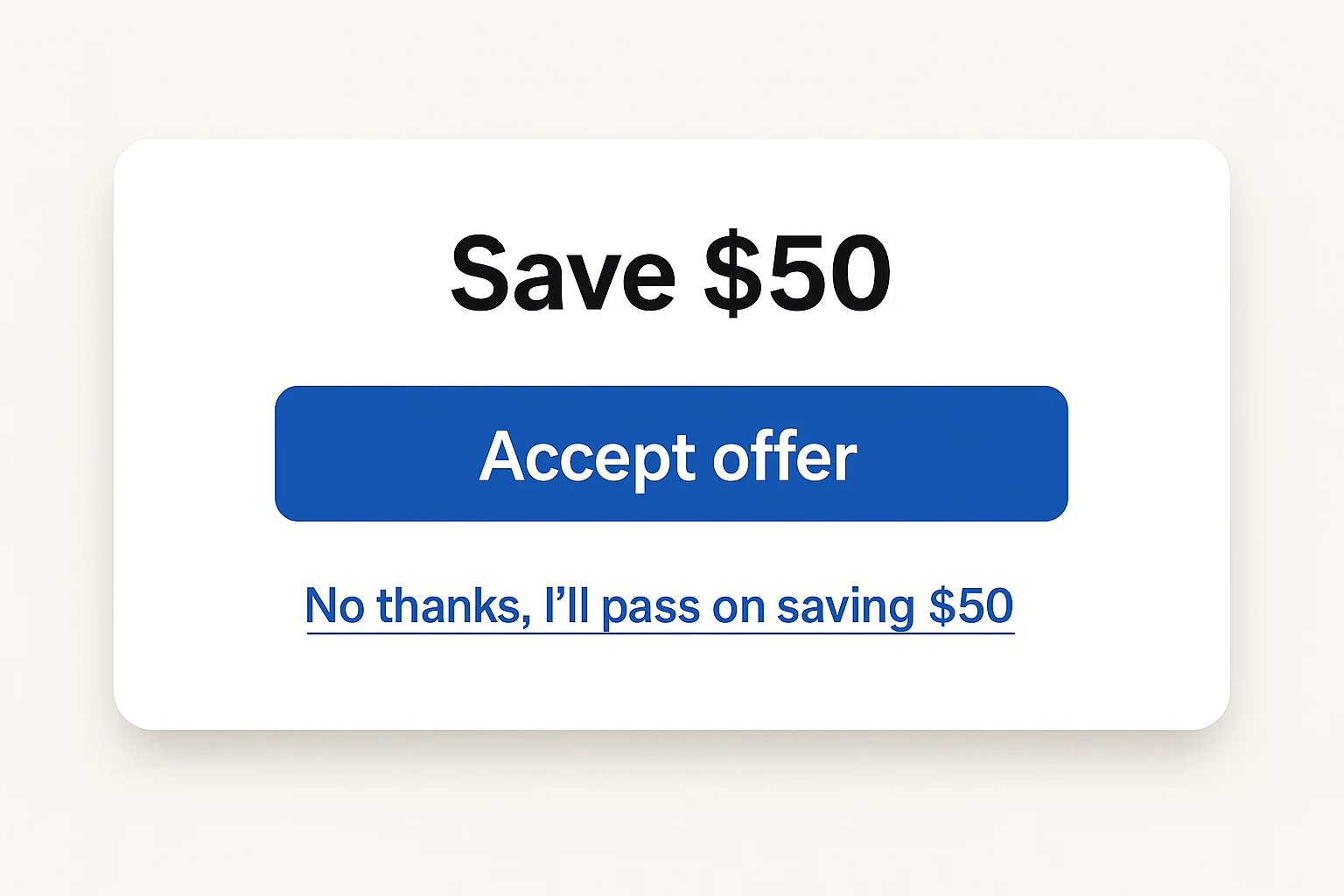
Imagine you’re using Mailchimp’s free plan to send out your weekly newsletter. It’s worked fine so far, but now you’re eyeing features you can’t access: automated welcome emails, A/B testing, list segmentation. You click over to the pricing page to see what’s behind the paywall.
Just as you’re about to leave, a pop-up appears:
“Upgrade today and get 20% off your first year.”
You move to dismiss it - but the opt-out isn’t what you expect.
Instead of a neutral “No thanks,” it reads:
“No thanks, I’ll pay 20% more for the year.”
You pause.
Same product. Same features. Same decision.
But now, saying no doesn’t feel like brushing something off. It feels like choosing to lose.
The psychology behind “no”
Most of the time, saying no is easy - because it doesn’t feel like saying no. It feels like skipping, closing, or dismissing. A non-decision. No harm done.
But when we reframe “no” to include the cost - what’s being left on the table - something shifts. That decision starts to feel heavier. More deliberate. And for good reason.
This taps into one of the most powerful findings in behavioral economics: loss aversion.
The idea was introduced in 1979 by psychologists Daniel Kahneman and Amos Tversky as part of their groundbreaking prospect theory. At its core is a deceptively simple insight: people feel the pain of a loss about twice as strongly as they feel the pleasure of an equivalent gain.
In other words, losing $100 hurts more than gaining $100 feels good.
This emotional imbalance flies in the face of classical economic theory, which assumes people make rational choices to maximize utility. Kahneman and Tversky showed that’s not how humans actually behave. Instead of weighing options logically, we react relative to a reference point - usually our current situation. And when a potential outcome feels like a loss from that baseline, we become cautious, even irrationally so.
That’s why a simple opt-out message like “No thanks, I’ll pay 20% more for the year” can create a micro-moment of tension. It reframes the action as a loss - and our instinct is to avoid it.
Their research, which laid the foundation for modern behavioral economics, was based on tightly designed experiments that showed consistent, real-world deviations from rational models. And what started as academic theory now underpins everything from product design to marketing strategy.
Loss aversion doesn’t just exist on paper - it’s visible in everyday behavior:
- People hold on to losing stocks longer than they should (the disposition effect)
- Consumers are reluctant to switch brands, even when alternatives are better (the status quo bias)
- We overvalue things simply because we already own them (the endowment effect)
And in marketing? Framing an offer as something to lose - not just something to gain - makes it more persuasive. That’s because “no” no longer means “I’ll pass.” It means “I’ll give something up.” And that tiny shift in framing can move people from autopilot to second thought.
The power of visible tradeoffs
Once you understand that people are naturally loss-averse, the next question is: how do you bring that insight to life in a digital experience?
The answer lies in how you frame the moment of refusal.
Most opt-out language is neutral by design:
- “No thanks”
- “Maybe later”
- “Skip for now”
These phrases are polite - but they’re also frictionless. They let the user back out without acknowledging what they’re walking away from.
But what happens when you make that tradeoff feel like a loss?
Instead of a plain “No thanks,” try:
- “No thanks, I’ll miss out on 20% off.”
- “No thanks, I’ll lose access to automation.”
- “No thanks, I’ll pass on premium features.”
- “No thanks, I’ll give up advanced reporting.”
This tiny change forces a micro-moment of reflection. Suddenly, the user sees the cost of inaction. That’s powerful - especially in contexts where decisions are made quickly and instinctively.
Why it works
Visible tradeoffs:
- Interrupt autopilot: Passive decisions become active ones.
- Sharpen contrast: Between the value being offered and the loss of not taking it.
- Trigger hesitation: Even a second of pause can change outcomes.
- Shift the frame: From “I don’t want this” to “I’m giving something up.”
The language matters
It’s not about guilt. It’s about clarity. And clarity comes from:
- Specificity: “I’ll lose access to advanced reporting” is more effective than “I’ll miss something.”
- Relevance: The loss should speak directly to the user’s goals.
- Light friction: Still optional and polite - just more intentional.
Where to use this
This tactic works especially well in fast-decision environments:
- Exit-intent pop-ups
- Plan comparison pages
- Pricing modals
- Trial upgrade screens
- Email CTAs
- Feature locks in freemium products
Wherever someone is one click away from “no,” you have an opportunity to make that moment count.
This isn’t about pressure - it’s about precision
Done well, visible tradeoffs don’t manipulate. They illuminate.
They make the loss clear, so the user can choose with their eyes open.
In marketing, clarity like this helps people make faster, better decisions.
Real-world examples of loss aversion in action
Loss aversion isn’t just a theory - it’s a powerful force that drives consumer behavior across industries. Smart marketers don’t just promise value; they highlight what customers stand to lose if they don’t act.
Here are real-world examples of how this plays out in the wild:
1. Free Trials That Create Ownership
Spotify Premium & Amazon Prime both offer 30-day free trials packed with features users quickly integrate into their routines - like ad-free listening or one-day shipping. Once the trial ends, users aren’t evaluating whether they want to pay. They’re reacting to what they’re about to lose.
Why it works: These trials create a new normal. Losing premium access doesn’t feel like going back - it feels like giving something up.
2. Try-Before-You-Buy Programs That Build Attachment
Warby Parker and Casper both offer generous home trials (5 days for glasses, 100 nights for mattresses). The longer users live with the product, the more attached they become - thanks to the endowment effect, a subset of loss aversion.
Why it works: People value what they feel is already theirs. Returning it feels like a loss, not just ending a trial.
3. Streaks and Virtual Progress That Drive Retention
Duolingo’s streak system is a masterclass in behavioral design. Users are reluctant to miss a day - not just to stay on track, but to avoid breaking their streak. Apps that award badges or track progress tap into the same bias.
Why it works: Virtual progress feels real. Losing it can be more motivating than gaining new features.
4. Protection Plans That Preempt Regret
Best Buy’s Geek Squad Protection sells peace of mind, not just service. Customers aren’t buying a warranty - they’re avoiding the potential loss of a failed device.
Why it works: People will pay to avoid imagined losses, even if the math doesn’t favor the purchase.
5. Loss-Framed Messaging That Reframes Value
Instead of saying “Earn 100 euros”, savvy marketers say “Avoid losing 100 euros”. Anti-aging products ask: “Don’t want to lose your smooth skin?” rather than “Want to maintain smooth skin?”
Why it works: Reframing benefits as avoiding loss taps directly into the emotional core of decision-making.
6. Smart Cart Messaging That Highlights Loss
E-commerce brands use dynamic cart messages like:
“Remove this item and you’ll lose your free shipping.”
“You’re $10 away from a free gift - remove now and you’ll miss out.”
Why it works: These prompts turn cart edits into high-stakes choices, triggering loss aversion in real time.
7. Money-Back Guarantees That Remove Purchase Risk
NordVPN’s 30-day money-back guarantee turns risk on its head. The customer isn’t risking their money - they’re risking missing out on a secure internet experience.
Why it works: By removing the risk of loss, the offer becomes easier to accept.
These examples show how loss aversion can be applied across channels, formats, and business models. Whether it’s a free trial, a loyalty program, or a piece of microcopy, the key is this:
Make the downside of “no” feel real.
Not exaggerated. Not manipulative. Just visible. Because when people know what they’re really walking away from, they think twice - and that second thought can make all the difference.
When (and when not) to use it
Loss aversion is a powerful tool - but like any tool, it can lose its edge when used too often, or in the wrong context.
Here’s how to know when to apply it - and when to leave it out.
Use it when decisions are fast and stakes are small
Loss-framed language works best in micro-moments: closing a pop-up, skipping a free trial, passing on an upgrade. These are low-friction decisions that often happen without much thought.
Making the cost of “no” visible in these moments slows the user down just enough to reconsider.
Avoid it when trust is on the line
Loss aversion should never feel like manipulation. If the offer is high-stakes - financial, medical, or deeply personal - avoid pressure tactics. For example, “No thanks, I’ll keep risking my health” or “No thanks, I’ll stay unprotected” crosses the line from persuasive to predatory.
When in doubt, choose empathy over urgency.
Don’t fake the loss
If the value isn’t real, don’t pretend it is. Users are quick to spot empty urgency or meaningless offers. Saying “You’re about to lose access to expert insights” only works if expert insights are actually being offered.
Misusing loss framing erodes credibility - and trust is much harder to regain than attention.
Watch for fatigue
When everything is framed as a loss, nothing stands out. If every modal, banner, or email uses loss language, users will start to tune it out - or worse, grow skeptical.
Use it selectively, where it creates genuine contrast or clarity.
Test it. Don’t assume it works
Loss aversion isn’t a magic button. In some contexts - especially where users feel pressured or overwhelmed - it can backfire. A/B test your messaging to see where it helps and where it hinders.
Ask:
- Does this reframe help the user see value more clearly?
- Does it feel respectful and relevant?
- Would I feel good seeing this message in my own inbox or product?
When used with care, loss aversion doesn’t just increase conversions - it increases clarity. It helps people weigh their choices with more intention.
And in a world of distractions, that pause is a powerful outcome in itself.
Conclusion
Loss aversion isn’t just theory - it’s a practical lever. When people see what they might lose, they think more carefully about what they say no to.
Whether it’s a pop-up, a pricing page, or an email CTA, small changes in language can shift passive decisions into intentional ones. Not by adding pressure, but by making the tradeoff clear.
Use it where it counts. Keep it honest. And always frame the value in terms that matter to your audience.
A small “no” that feels like a loss can be the nudge that leads to a meaningful “yes.”