Stop Drowning Readers in Text
The way your content looks on the page can determine whether it gets read or ignored entirely.
Picture this: You're on your phone, thumb hovering, eyes scanning. Then it hits - a solid wall of words. No line breaks, no breathing room. You flinch, hesitate, and swipe on. Whatever it was trying to say is now lost.
You're not alone.
Formatting isn't window dressing. It's a reader’s first impression, their invitation - or their warning sign. Done well, structure whispers, "This will be easy, even enjoyable." Done poorly, it screams, "Too much work."
Let’s break down how clean formatting - especially subheadings and short paragraphs - does more than tidy things up. It creates flow, builds trust, and keeps your message alive.
Structure isn’t just helpful. It’s survival.
Most readers don’t arrive ready to devour every word. They arrive cautious, skeptical, scanning for value.
They ask: Is this for me? Will it be quick? Clear? Worth my time?
Now, imagine they land in a thicket of uninterrupted text. Their eyes dart, searching for anchors - headings, spacing, bullet points - anything to guide the way. Without those cues, the brain starts to protest. Attention flickers. Engagement dies.
But when your content looks light, with clear breaks and smart signals, it feels doable. A heading here, a two-sentence paragraph there - it tells the reader: "You're safe. You won't drown."
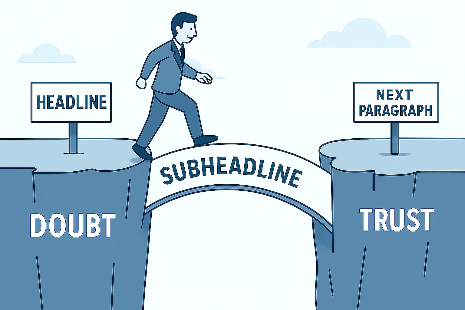
Subheadings: The signposts of content
Subheadings are not just labels. They're landmarks.
Imagine driving on a highway with no signs. Every exit looks the same. You're tense, unsure where to go. That’s what unstructured content feels like.
A good subheading, on the other hand, tells the reader exactly where they are - and where they’re going. It promises clarity. It breaks the scroll.
And for search engines? It creates a roadmap they can follow.
Short paragraphs: The reader’s lifeline
Ever tried reading a paragraph that stretched longer than your phone screen? It's like trying to sip from a firehose.
Short paragraphs are not just easier on the eyes. They're easier on the brain. Each one acts like a breath between thoughts - a pause that keeps readers from burning out.
And yes, what looks fine on desktop may feel overwhelming on mobile. One chunky paragraph on your laptop becomes five screens' worth of scrolling on a phone. Respect the small screen. Break early. Break often.
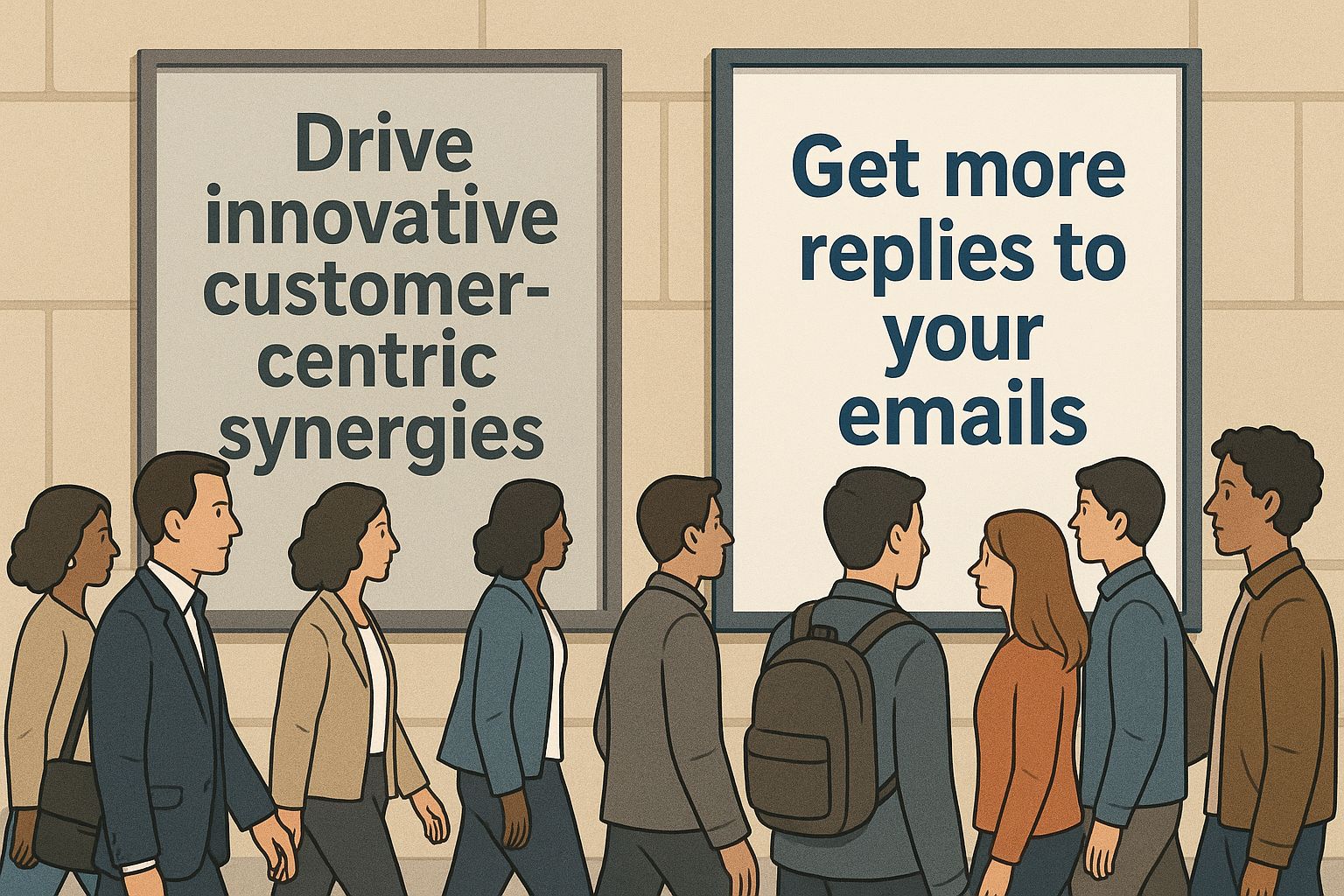
Let’s see the difference
Before:
We are excited to share the next phase of the product roadmap, which includes feature enhancements across multiple teams. These updates are the result of cross-functional collaboration and feedback from early users. While this is still a work in progress, we believe the new structure will significantly improve user workflows, especially in mobile environments. Additional information about deployment timelines and team responsibilities will follow in next week’s briefing.
After:
- Cross-team enhancements based on early user feedback
- A focus on improving mobile workflows
- Detailed rollout plans coming next week
We’re still finalizing a few details, but the direction is clear - and shaped by real user insights.
The contrast is immediate. The second version trims the excess, highlights the essentials, and guides the reader to what matters most.
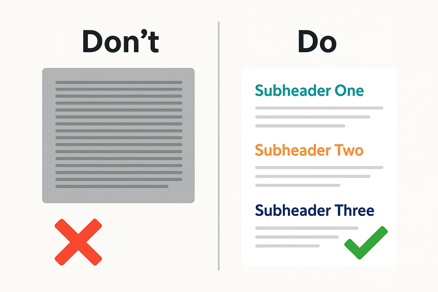
Your formatting field guide
Before you publish, run through this checklist:
- Use bulleted or numbered lists for scannability
Structure any list of three or more points to improve readability and flow. - Avoid justified text
Left-aligned copy reads more naturally. Justified blocks create distracting gaps. - Leave space between sections
White space isn’t empty. It’s clarity. Use it. - Use bold and italics sparingly
Emphasize what matters, but don't overdecorate. - Always preview on mobile
If it's a chore to read on a phone, it won’t get read.
Keep this list near. It’s your toolkit for making content not just readable, but welcoming.
You’re not just writing. You’re designing an experience.
Formatting is the first thing your reader sees, and it decides whether they see anything else.
So before you ask, “Did I say what I meant?” ask instead, “Would I read this if I were scrolling past?”
That’s how you stop losing readers. That’s how you earn their attention - and keep it.